Projects
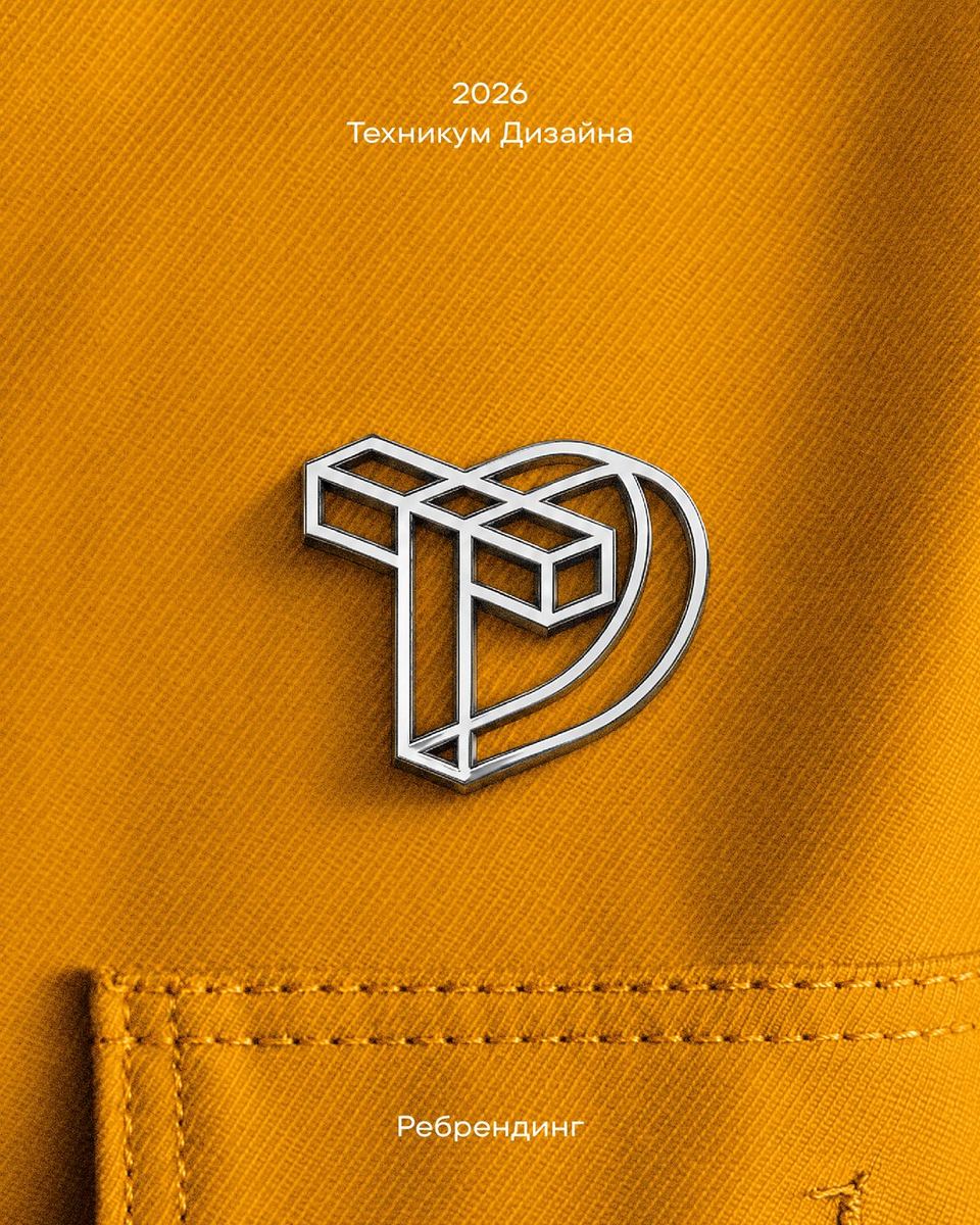
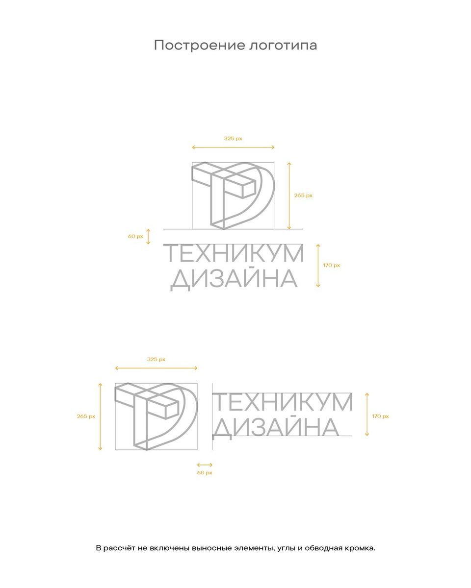
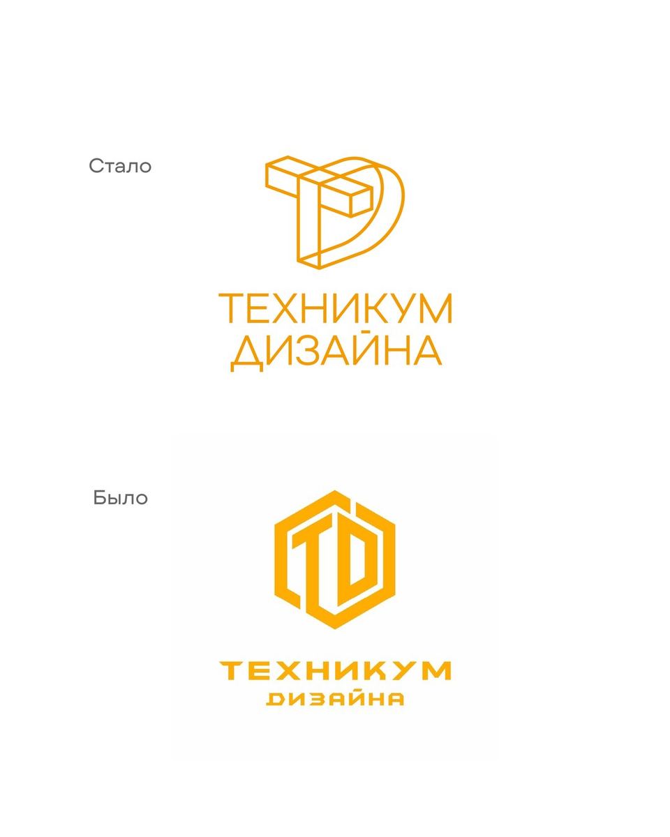
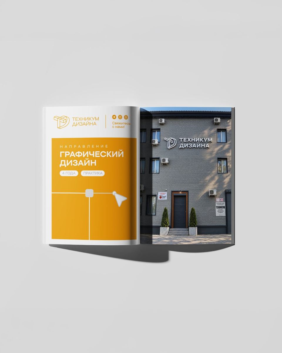
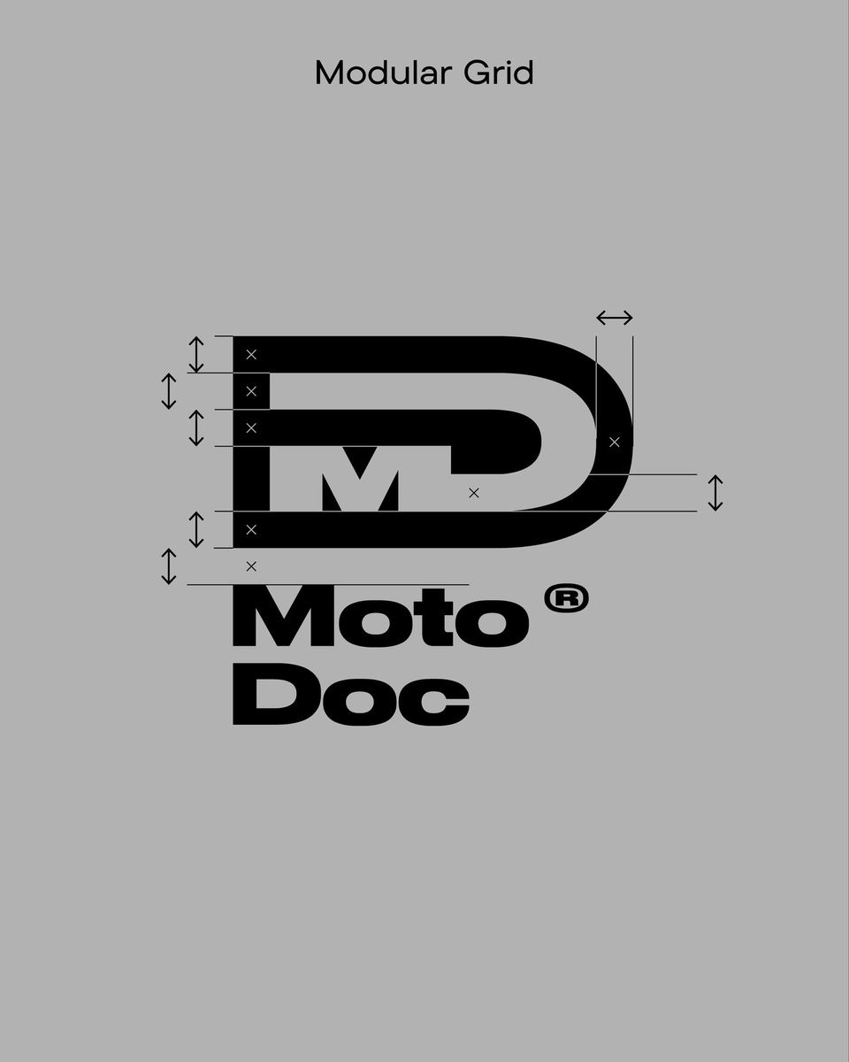
The logo is built on an isometric construction that merges the shapes of the letters into a single system. This approach reflects the idea of modularity: many directions and visual languages can exist independently while remaining part of one interconnected structure.
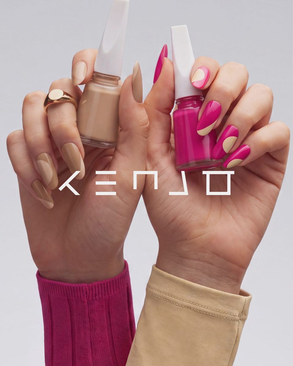
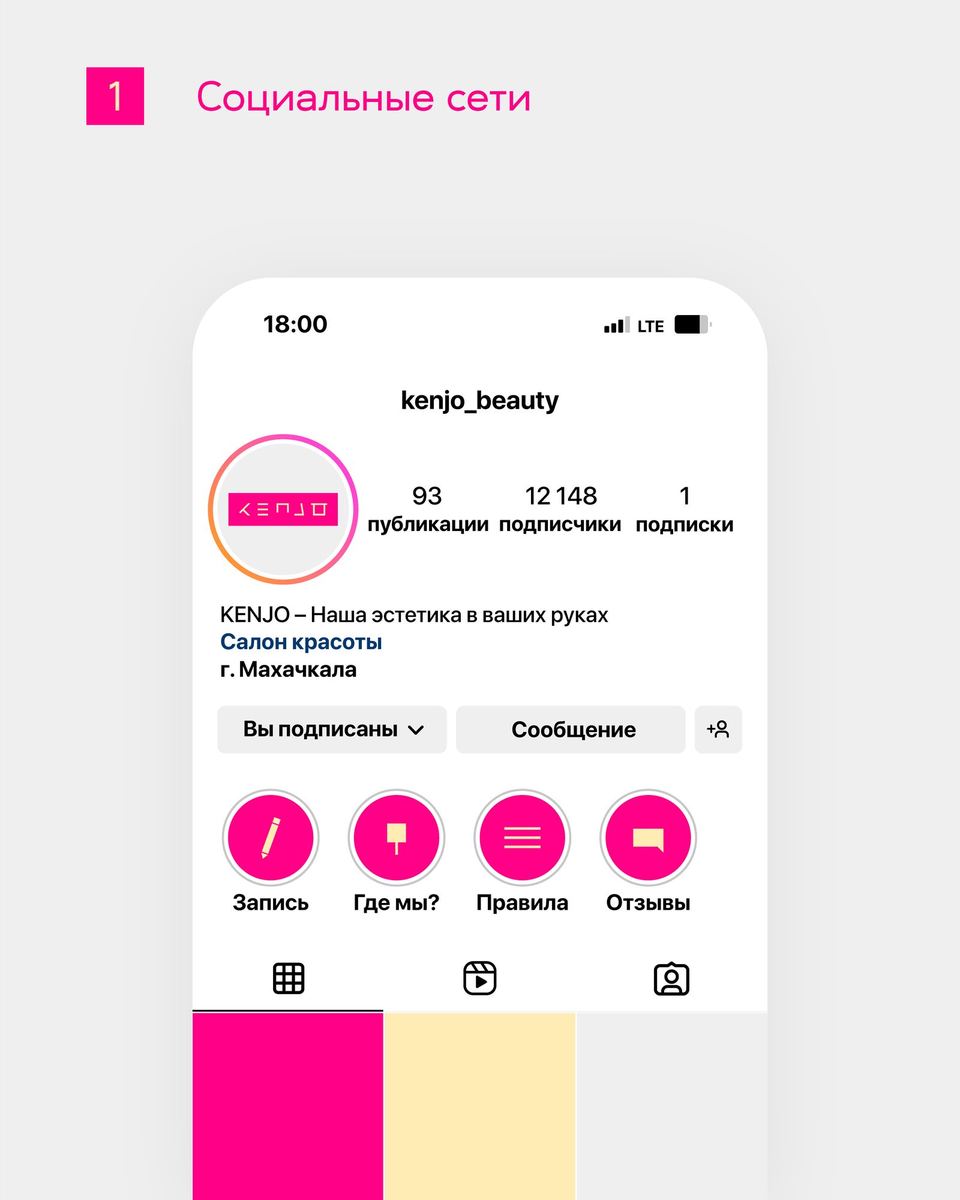
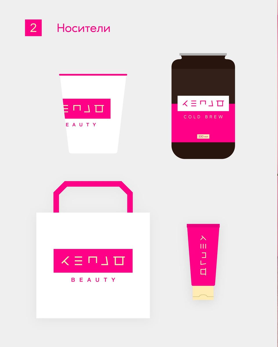
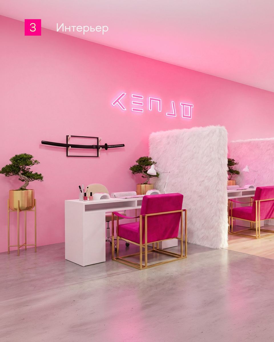
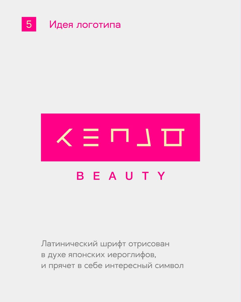
This is a case where I was faced with the task of connecting the beauty sphere with Japanese aesthetics, since the customer was inspired by it. As one of the meanings of the hieroglyph that sounds like KENJO, one can find the idea of honoring the work of the master and respecting the guest. As a solution, I stylized the Latin alphabet as Japanese grotesque characters, emphasizing their characteristic elements. There is also a winking emoticon hidden in the sign, which becomes the highlight of this case.
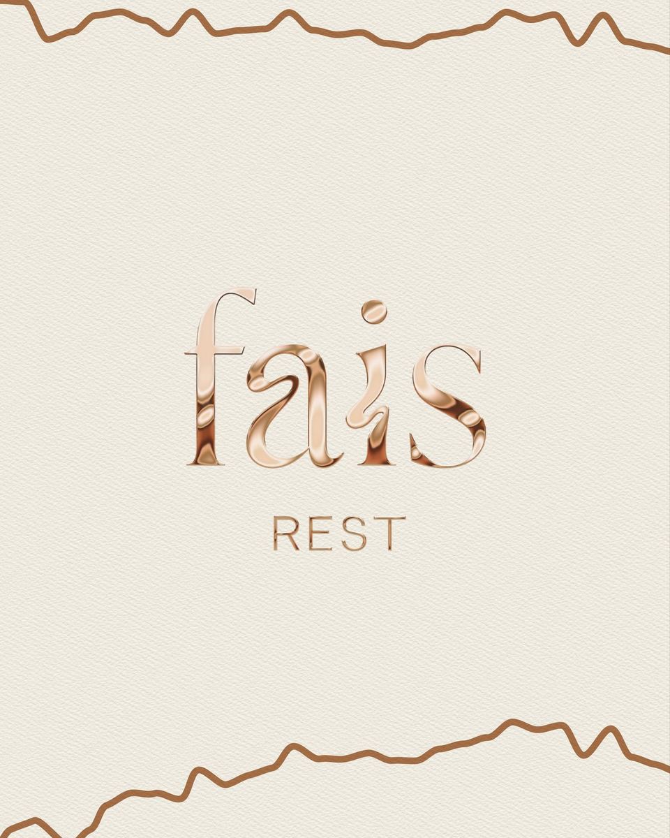
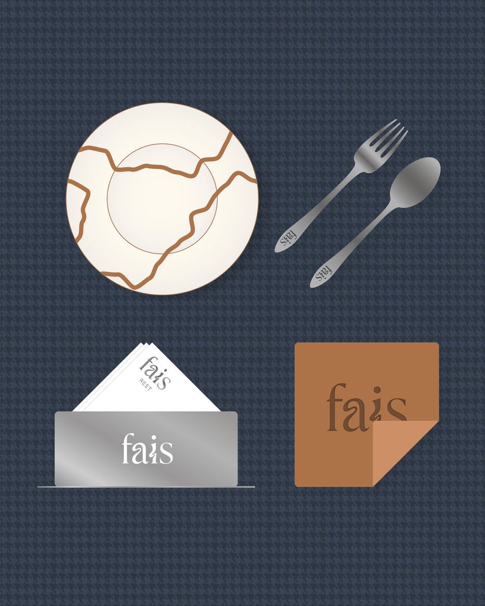
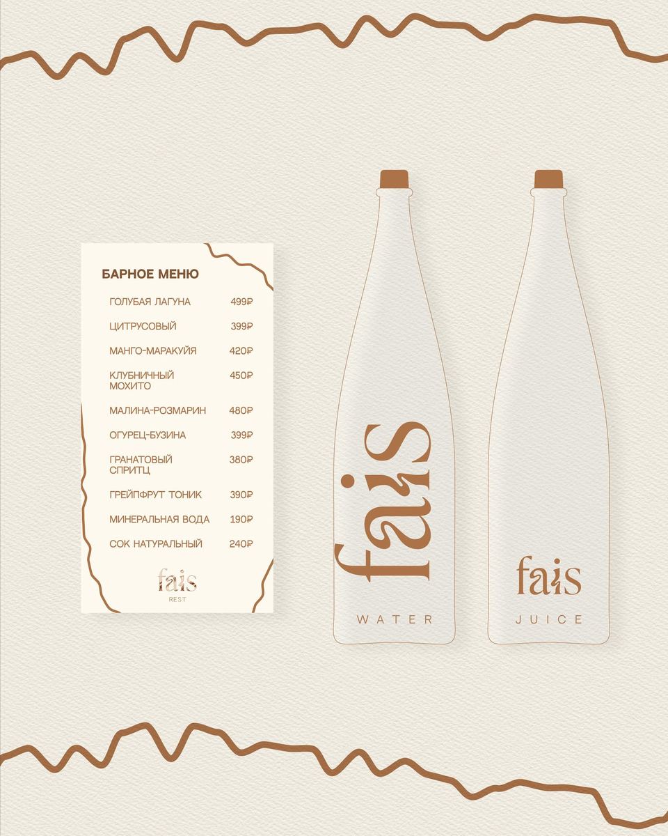
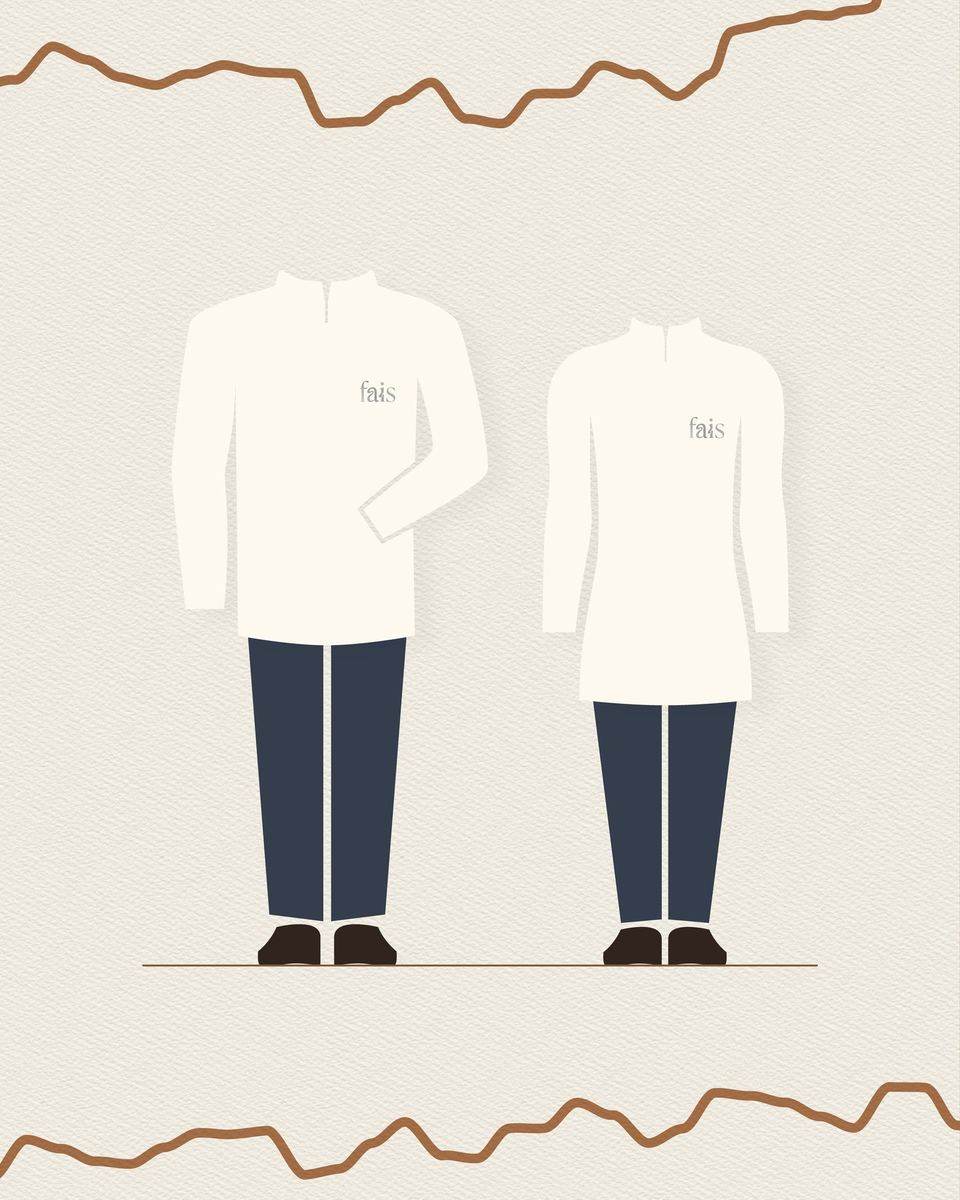
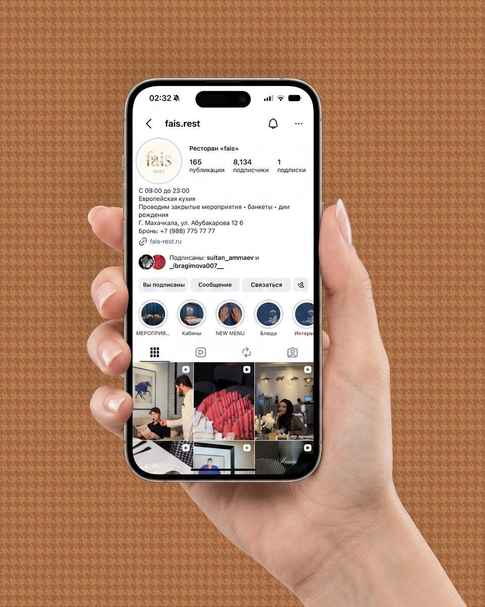
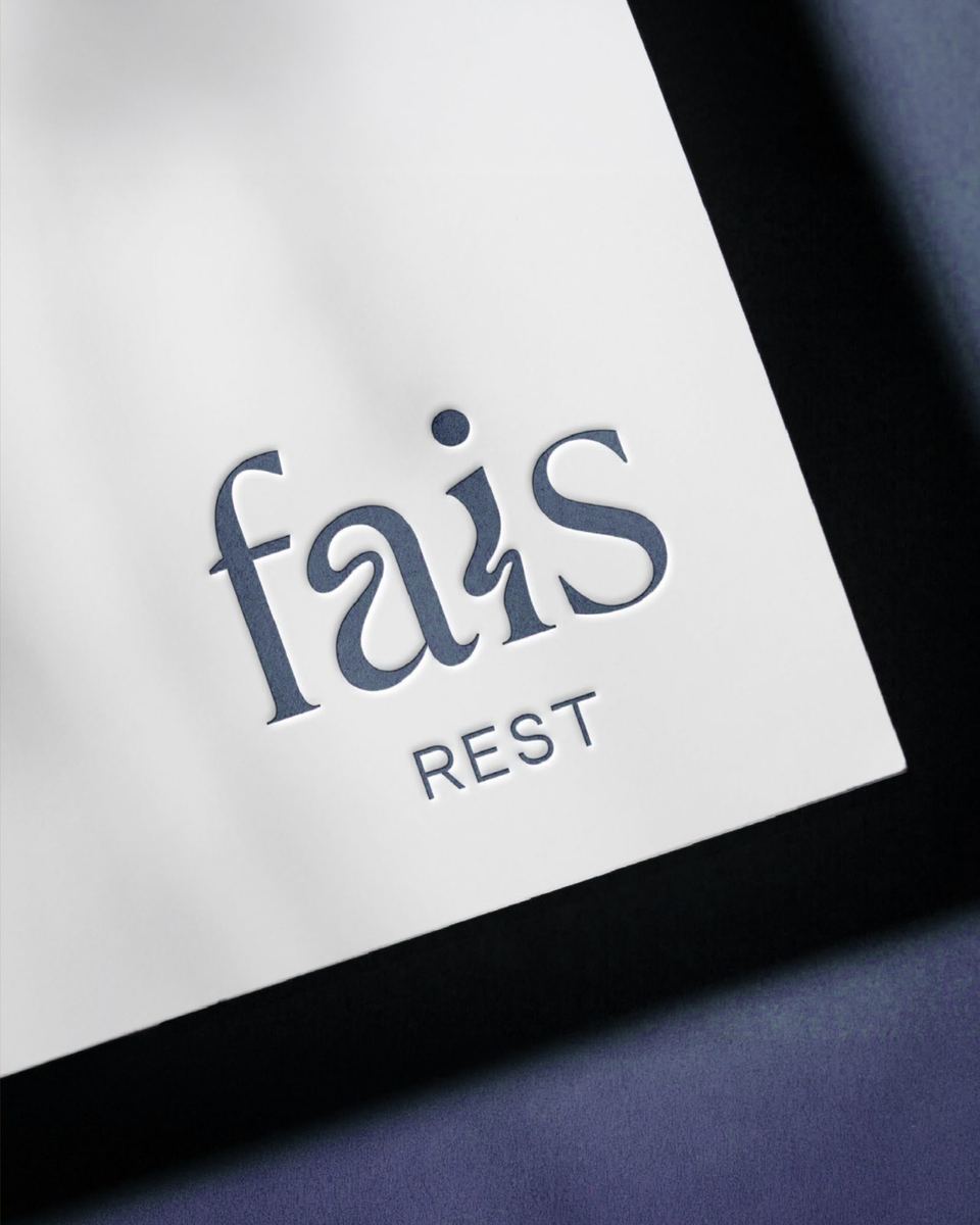
The restaurant approached me during the final stages of opening. After talking with the customer and finding out what the interior would be like (something close to classic modern), I proposed a logo option with a serif design that has smooth deformations. The sign turned out to be recognizable. It was decided to emphasize this shape using the texture of soft glossy metal and chaotic lines, reminiscent of handwritten scribbles and acting as an element of identity. Otherwise, the corporate style is in harmony with the interior of the restaurant, reminiscent of the materials often found in it.
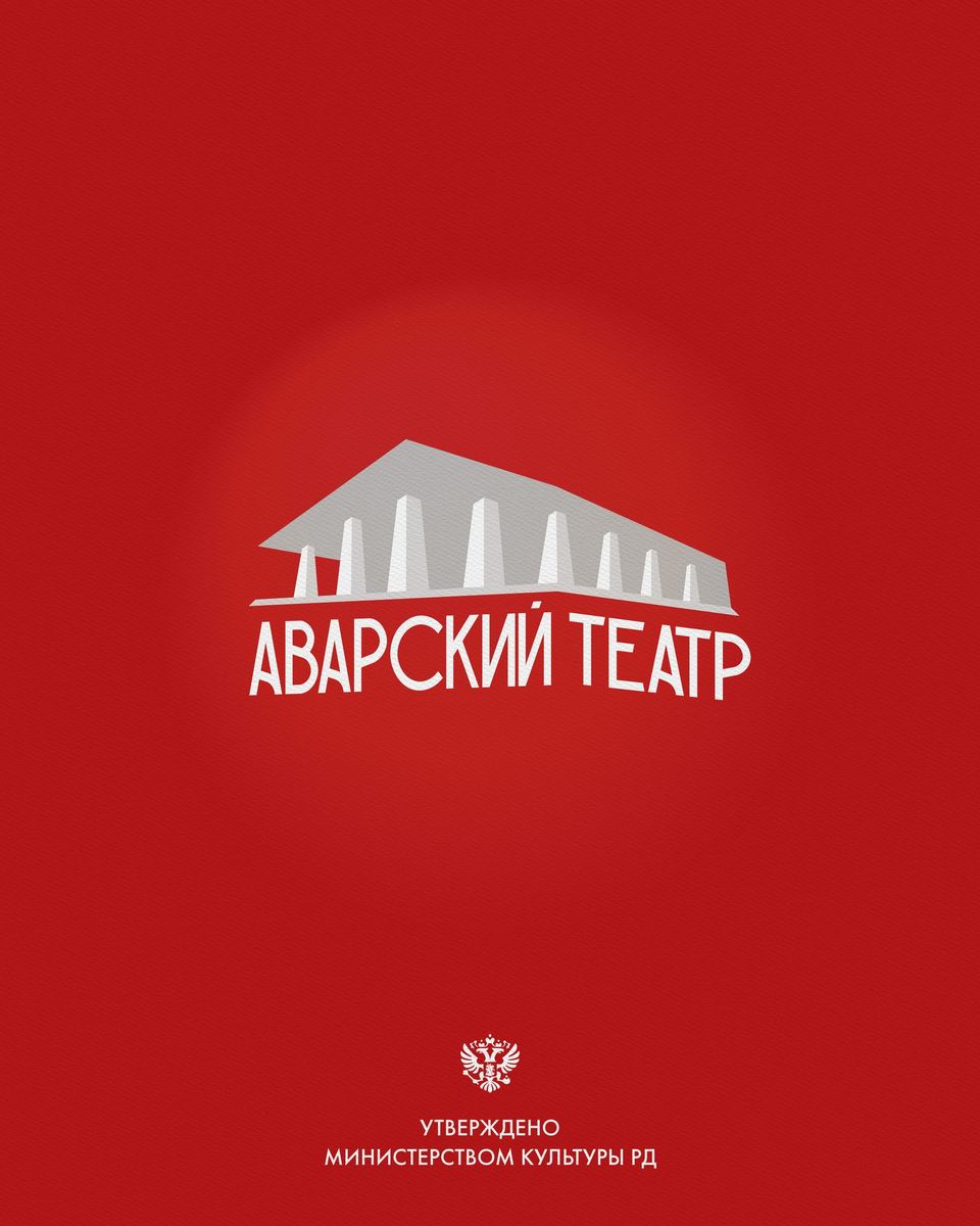
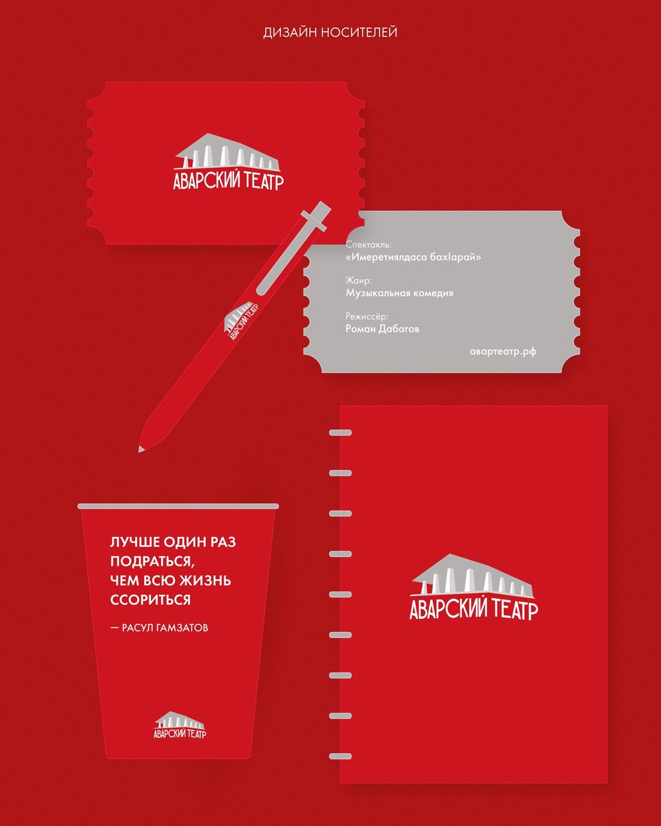
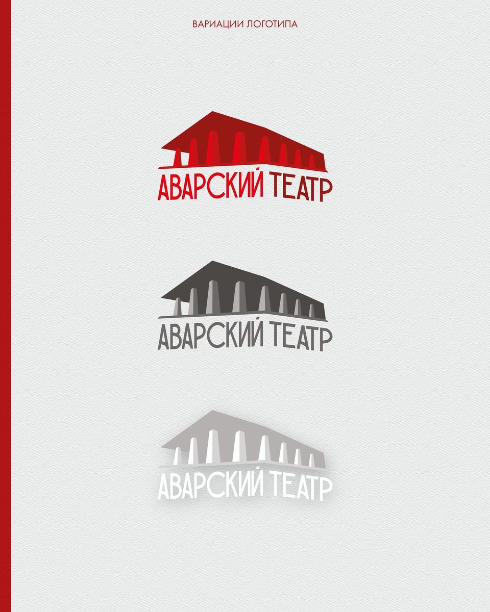
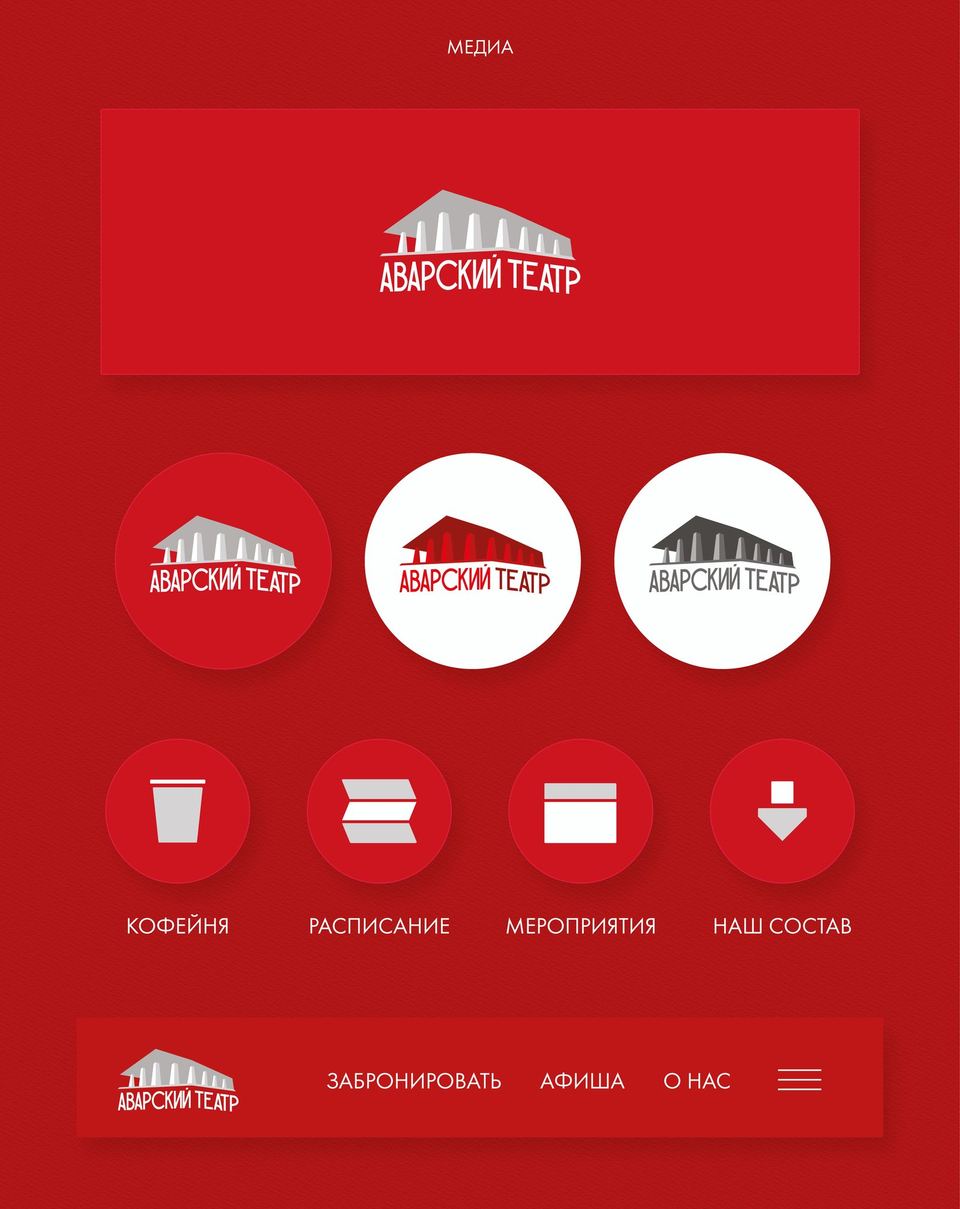
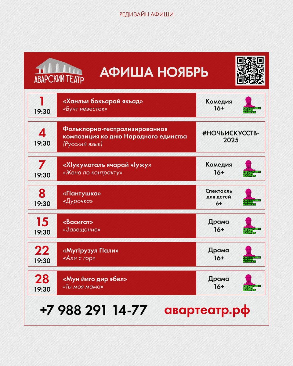
From the very beginning of working on the logo, I wanted to use the recognition of the building designed by Gennady Movchan to emphasize its monumentality. The building of the Avar Theater is a landmark in Dagestan, so at the stage of developing the sign, I made 3 versions of the logo with the building, and a couple without it. Based on the results of discussions and trusting the preference of the world-famous artist Ibragimkhalil Supyanov, the theater management settled on the most complex, but also the most colorful version of the logo. It includes an illustration of the theater itself and text written in an ethnic script that serves as the "base" for the building.
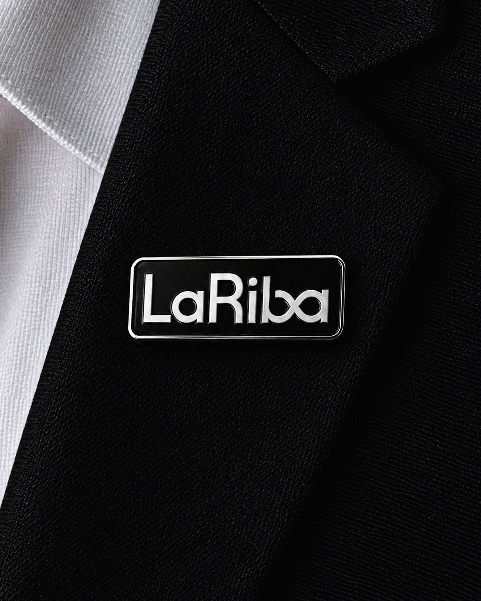
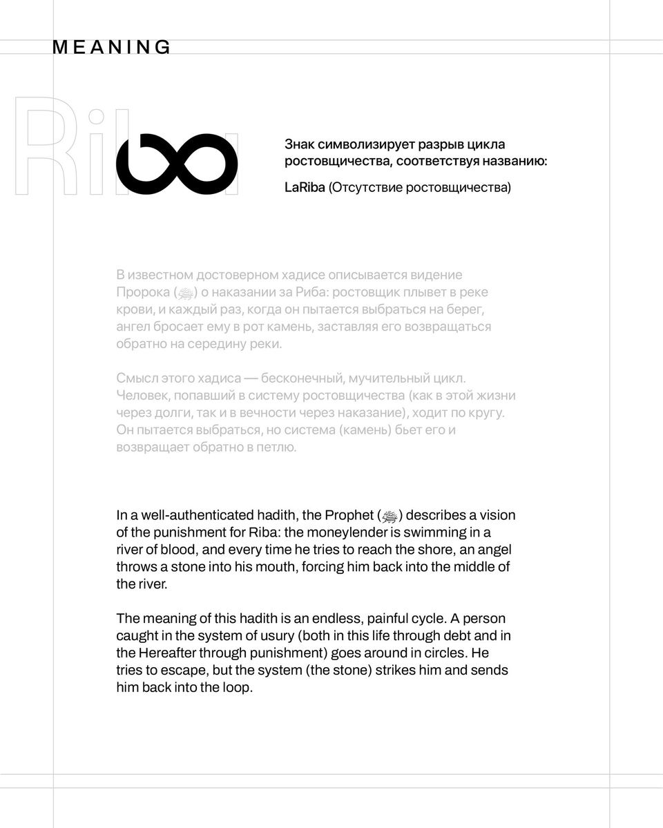
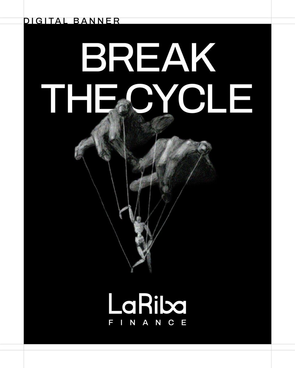
After a couple of days of searching, I came across a hadith about the uninterrupted cycle of usury, and after drawing many forms, the most concise one to reflect the essence of the hadith turned out to be the lemniscate. The sign was open because the brand was built on the philosophy of rejecting usury (and therefore the vicious cycle). The emblem found a place in the font part. This is how a symbol was developed that refers us to the history of Islam and clearly reflects the positioning of the LaRiba brand.
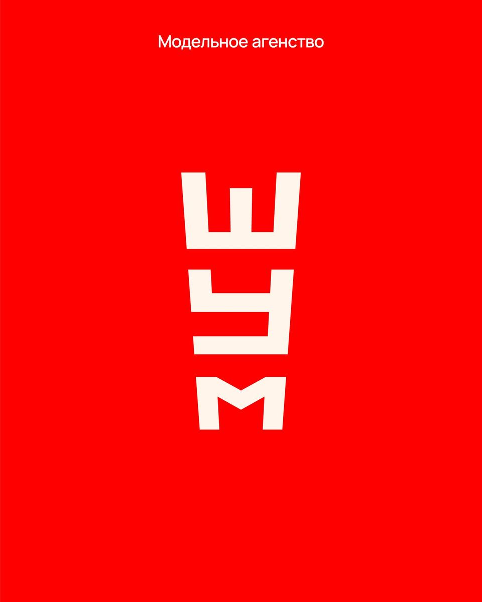
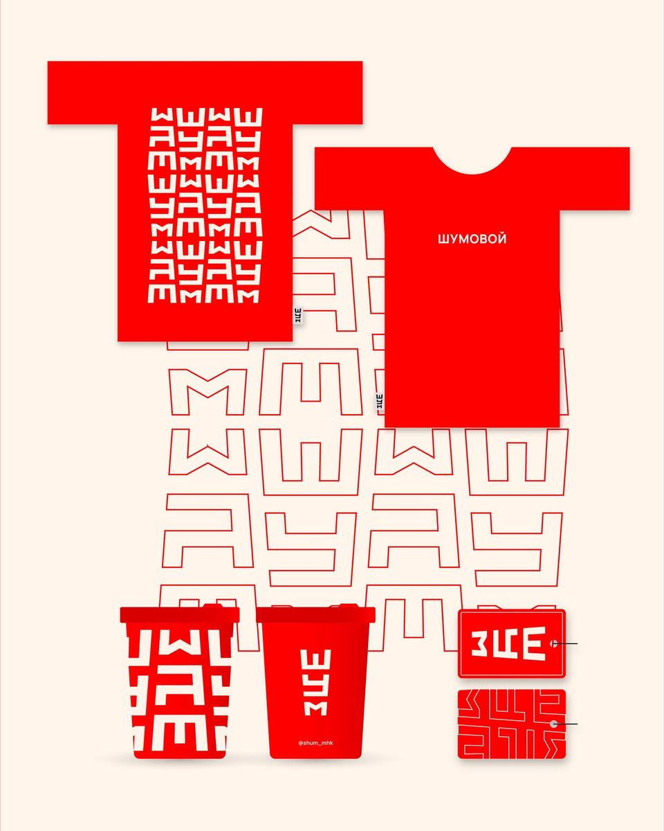
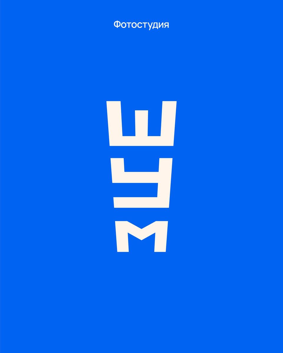
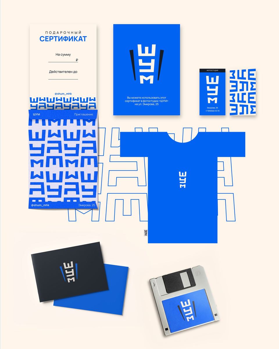
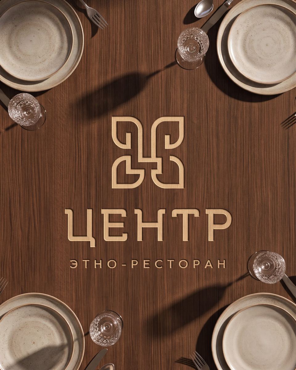
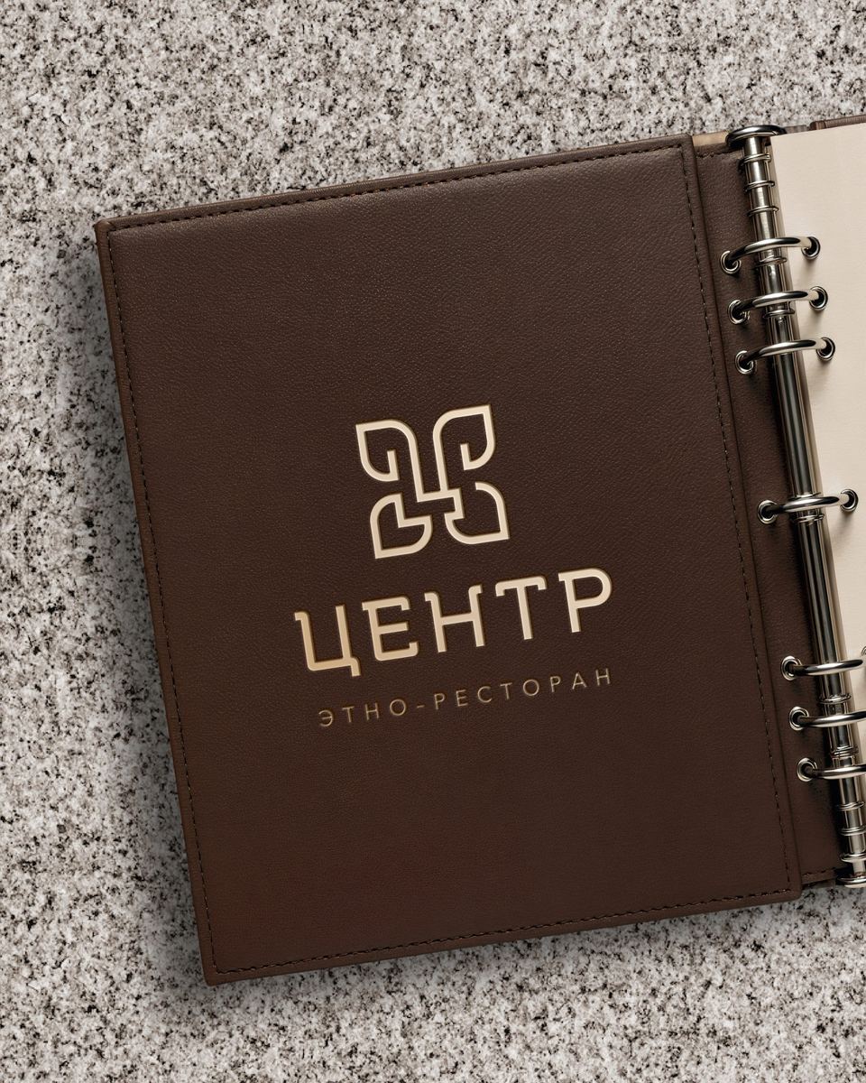
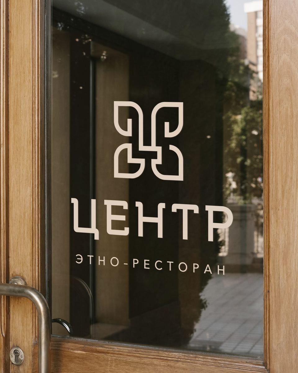
The idea is that the “CENTER” is a place where people are intertwined, which is reflected in the sign itself. It was necessary to make the logo ethnic, so I drew swirls in the font part. I tried not to overdo it with the swirls so that the restaurant wouldn’t turn into a diner.
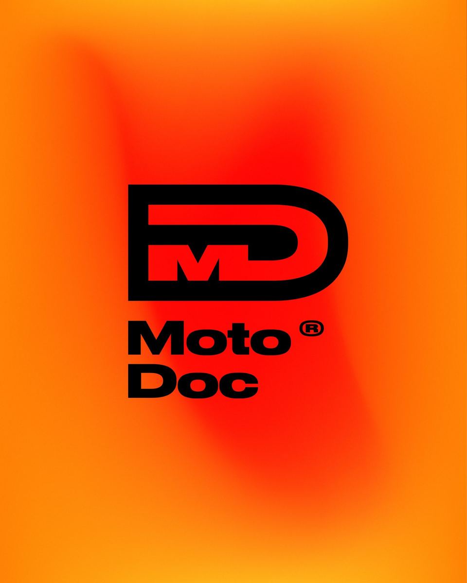
We received a request to develop a minimalistic, strict logo for a motorcycle repair and restoration service. It was important for the customer that everything looked serious and not too bright. So I took one smooth transition of hot colors as an accent, and pure black as the main color. The sign itself is a monogram of wide grotesque letters with a laconic connection. The text part is also written in a wide font.
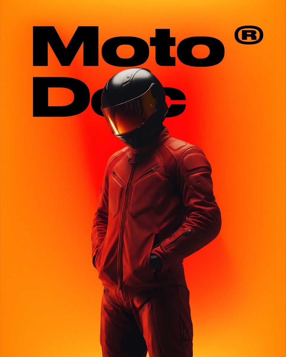
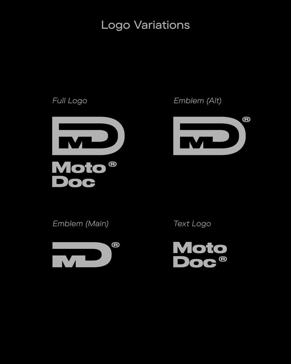
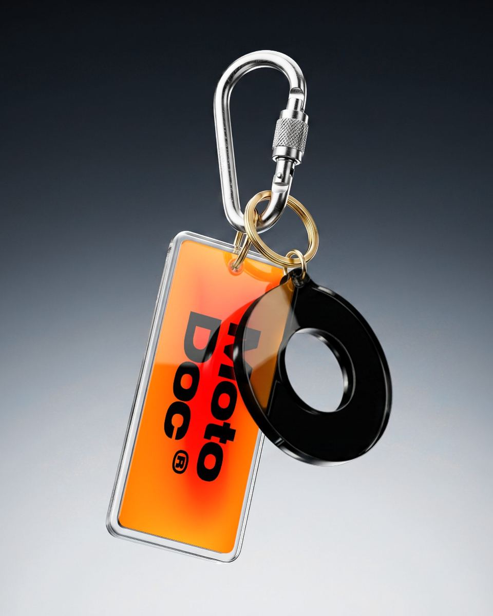
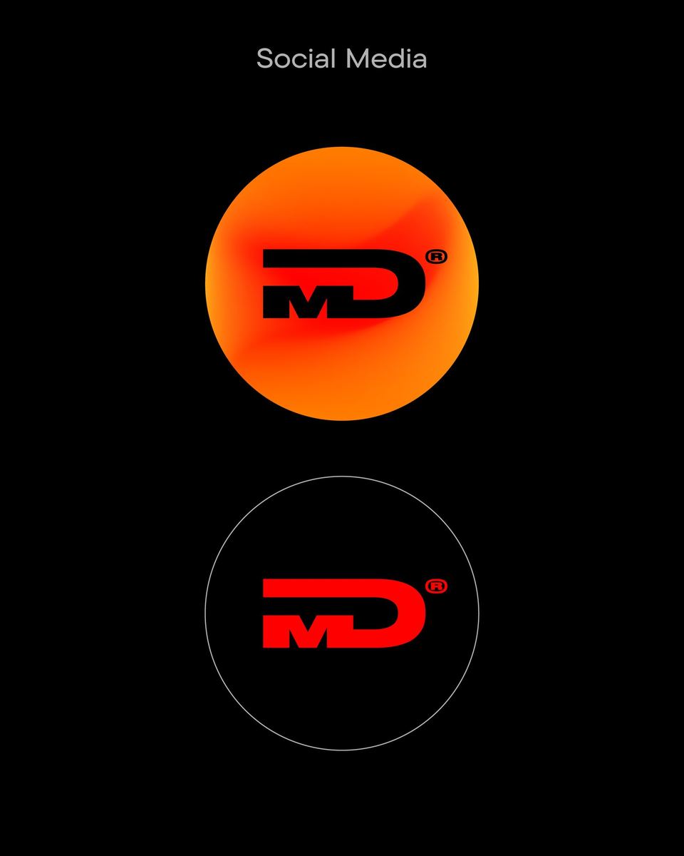
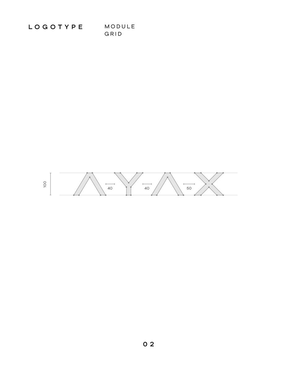
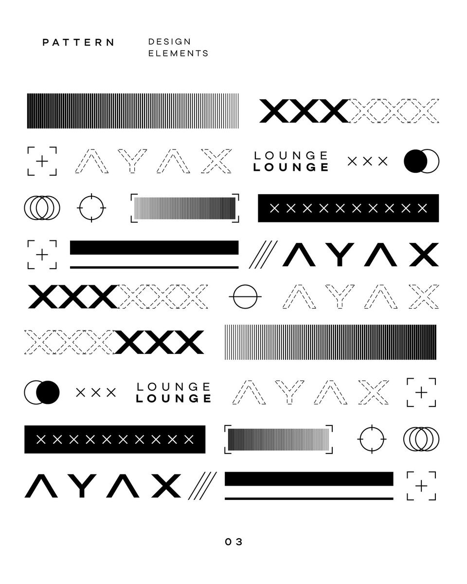
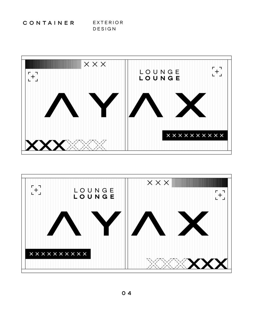
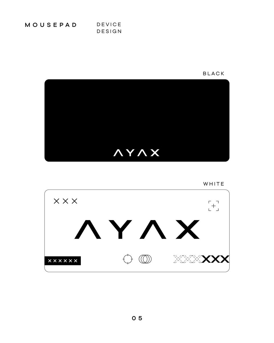
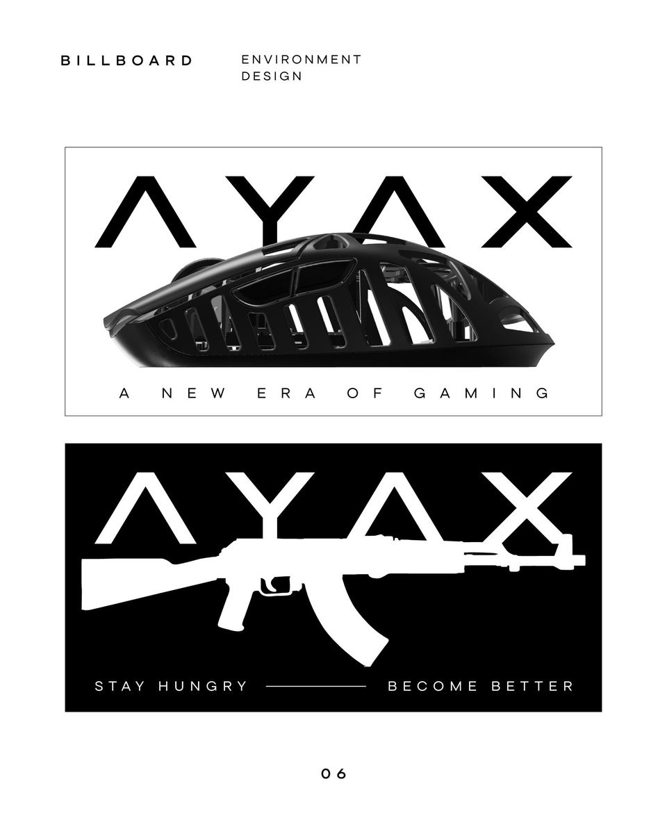
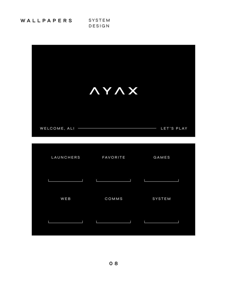
A network of computer clubs in capsule format in Kazakhstan. The idea impressed me and seemed like something truly innovative in this area. This formed the basis for the logo and the rest of the style. I tried to convey a sense of innovation through the air in the composition, and technology through a simplified font. While looking for references, I remembered a game skin that I really liked. Having studied it, the main technique for conveying this vibe turned out to be micrographics. From it I formed the pattern and the rest of the graphics.
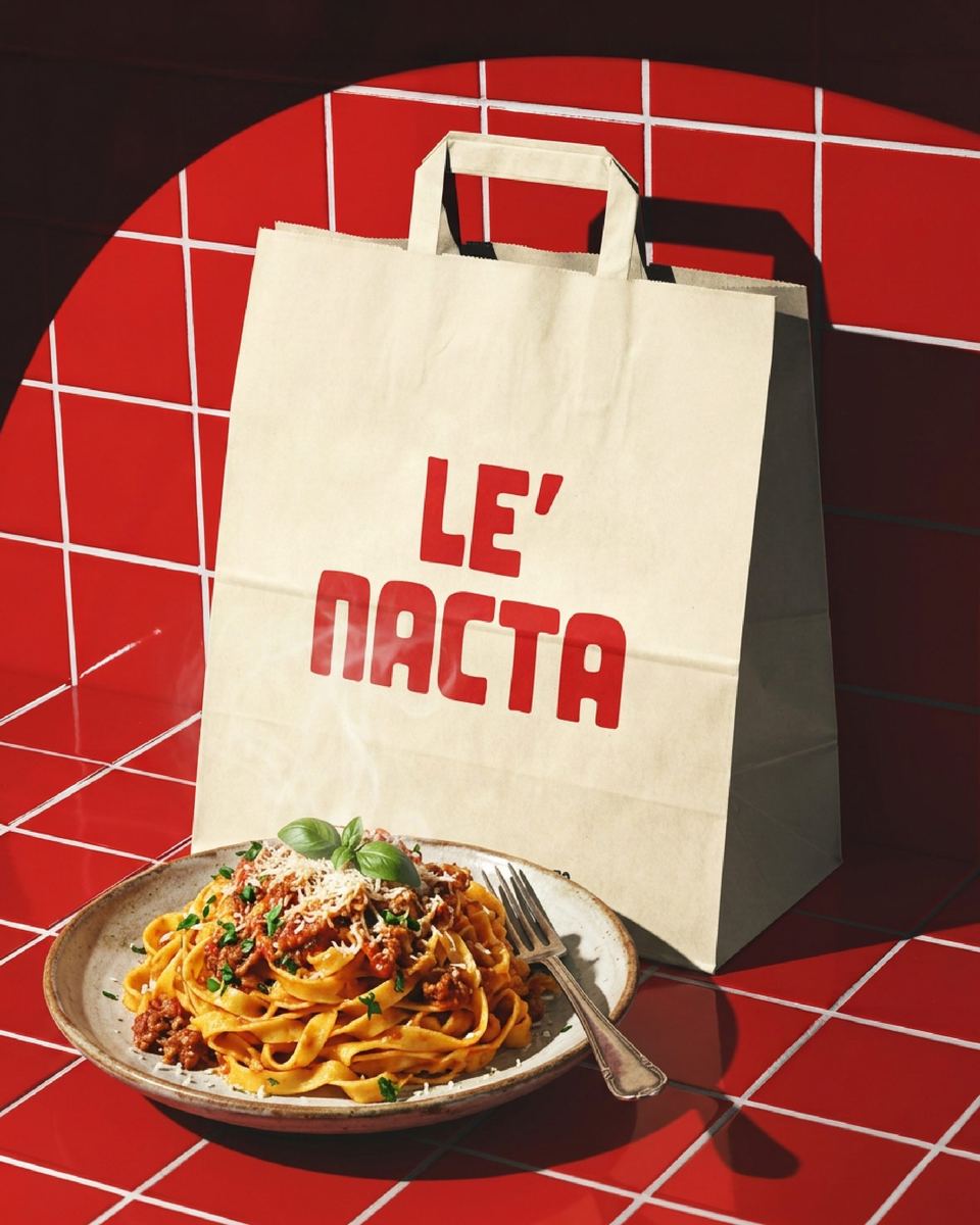
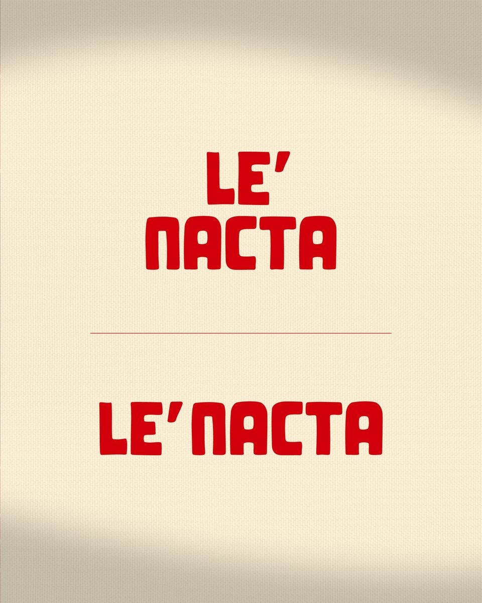
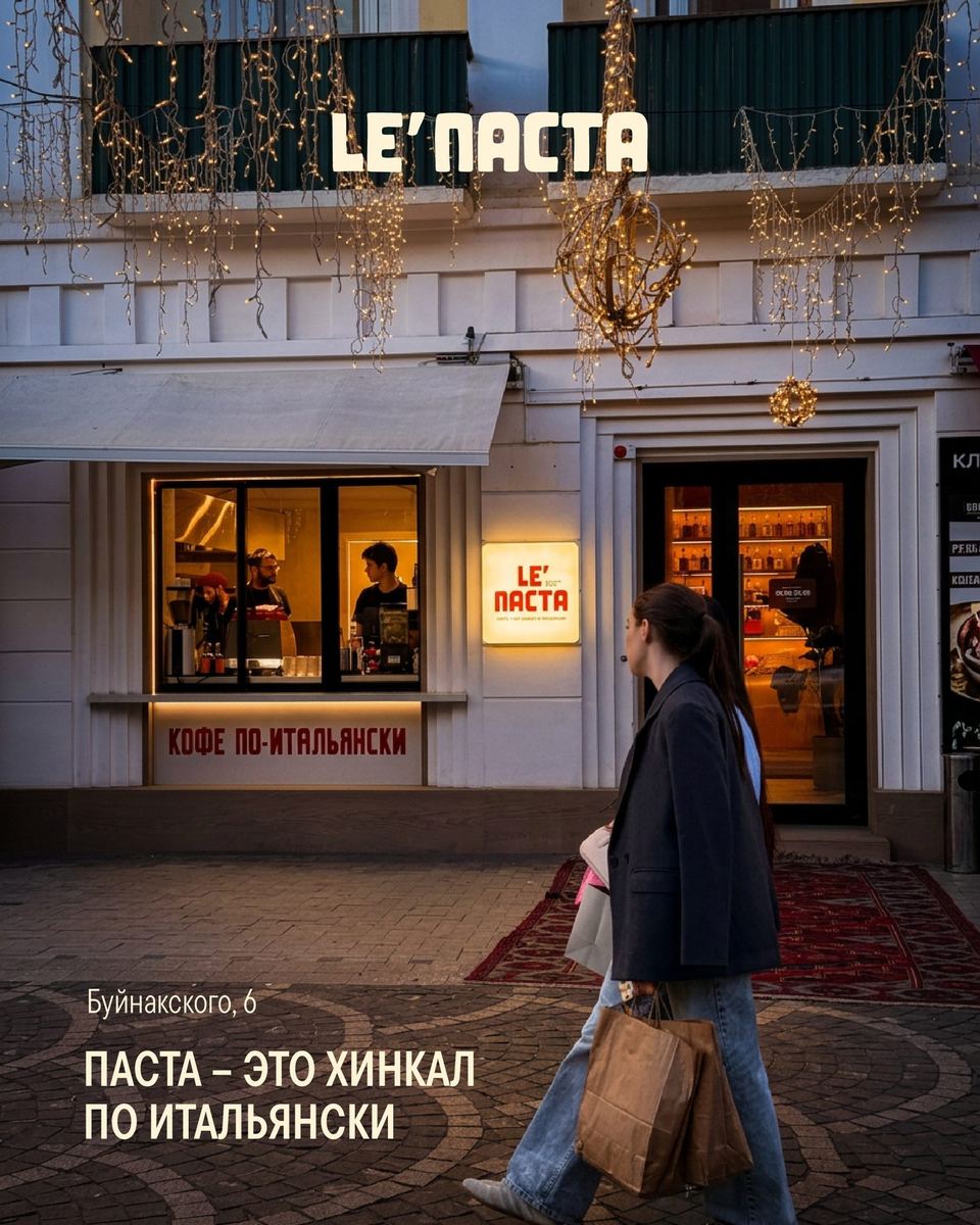
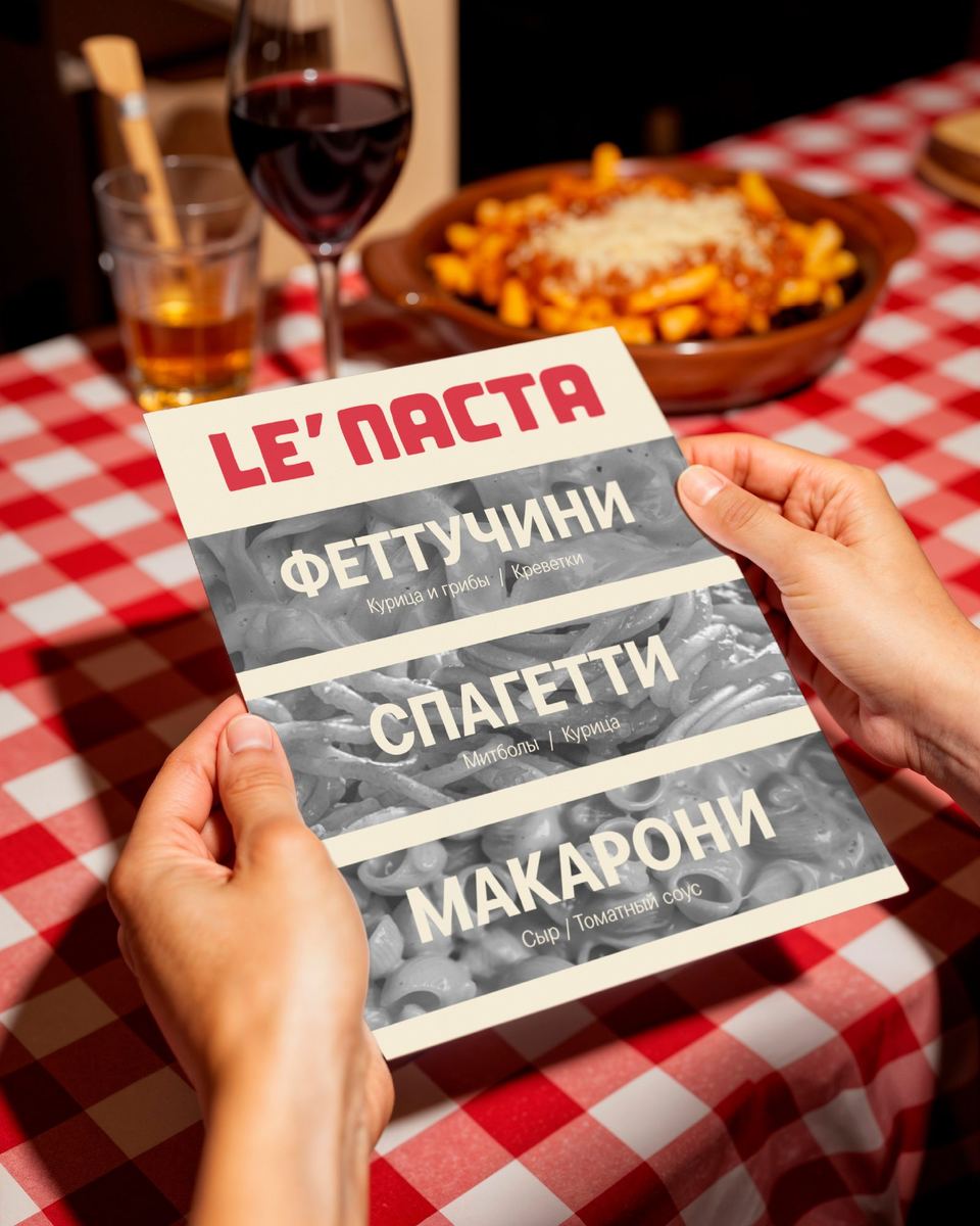
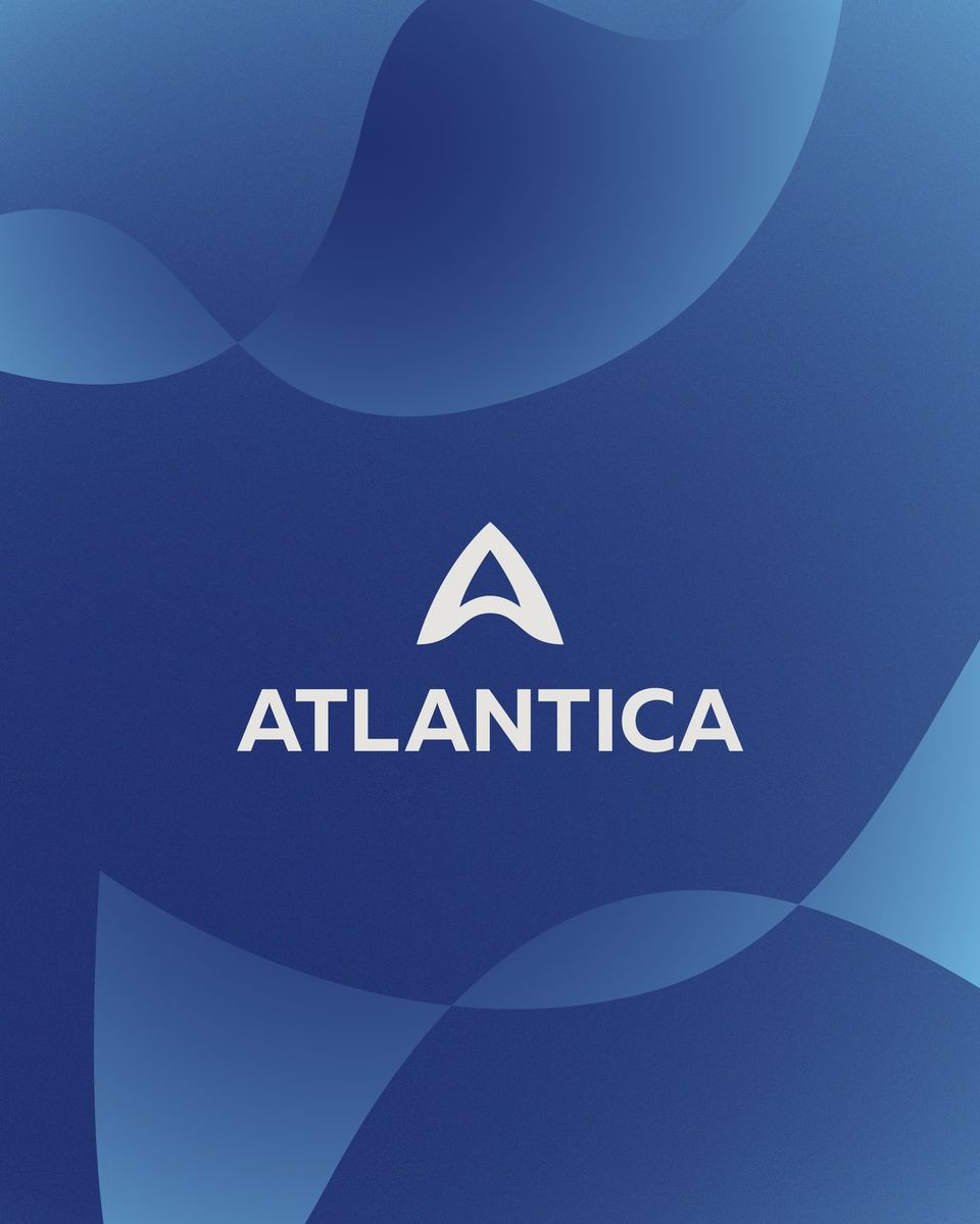
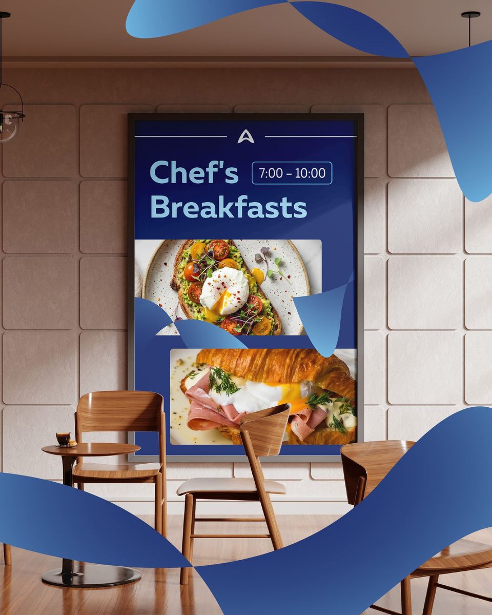
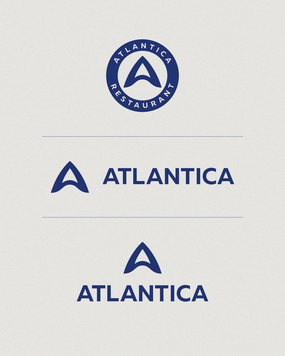
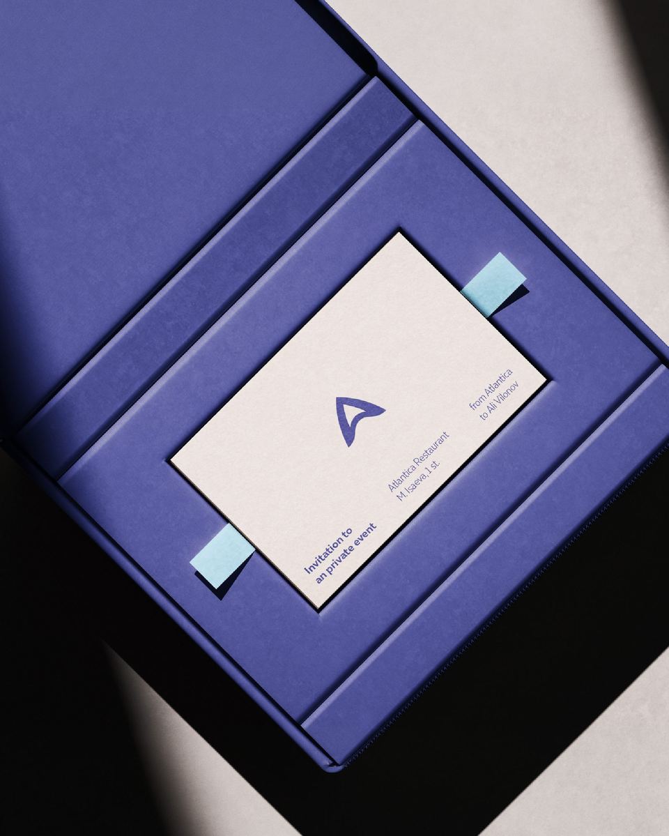
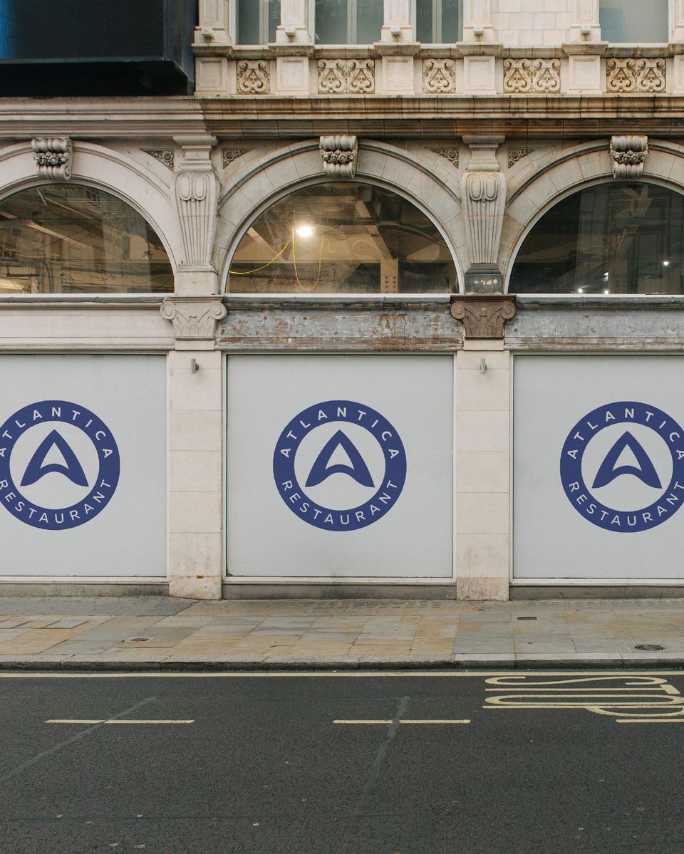
In the sign, the letter A resembles the shape of sea creatures and also refers to the hotel pool. Everything is complemented by patterns in blue shades, complementing the “sea” image of the restaurant.
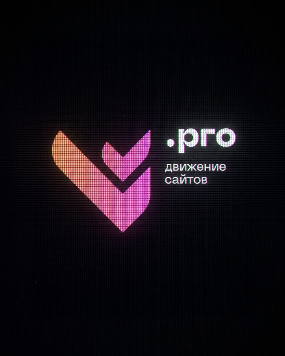
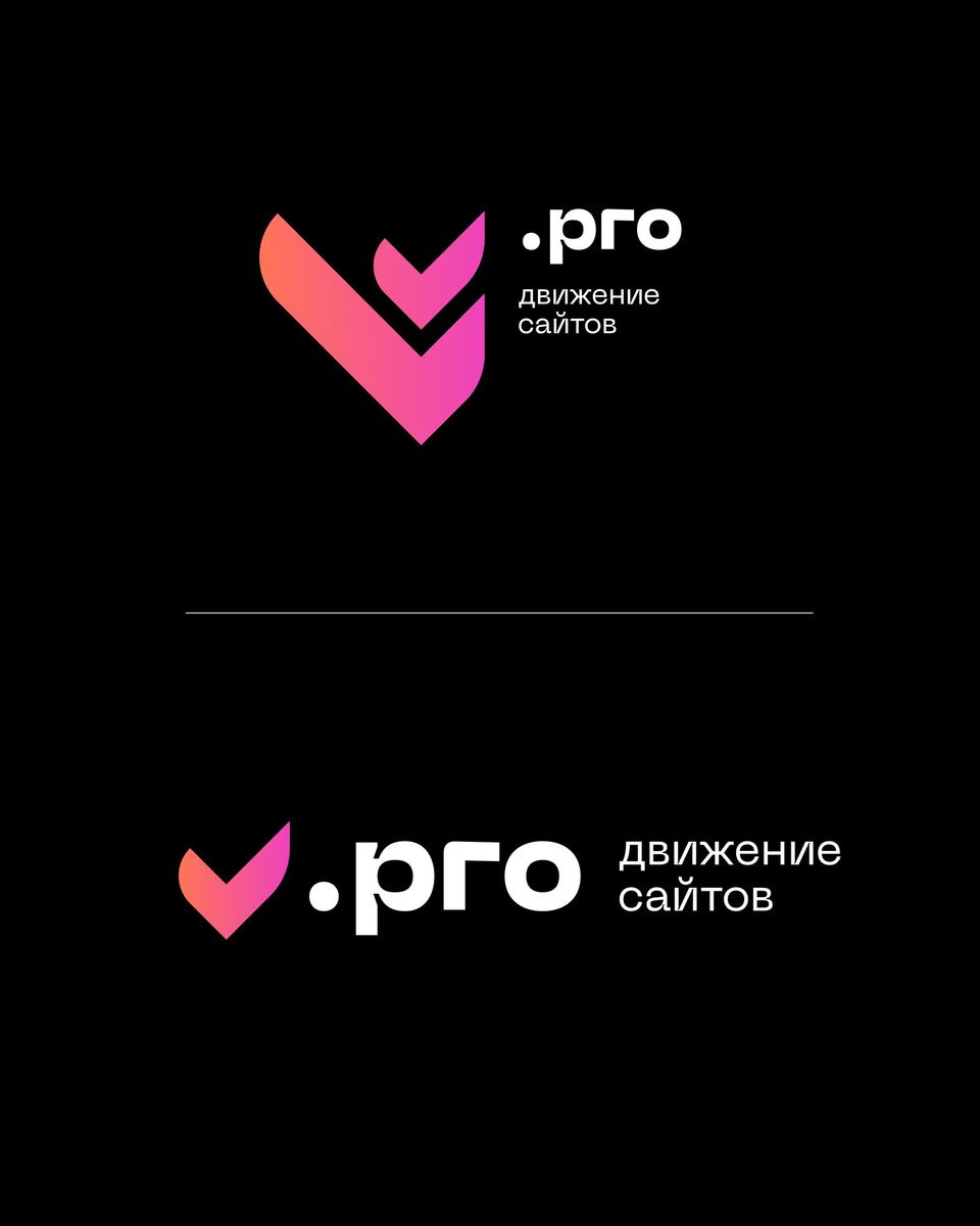
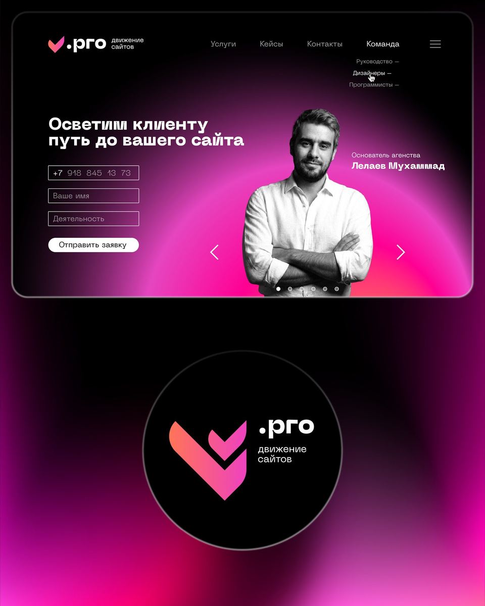
The checkmarks that make up the main sign symbolize completed tasks and also represent two letters L at an angle, referring to the name.
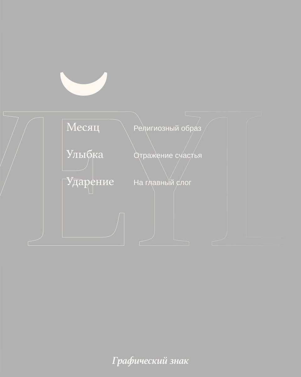
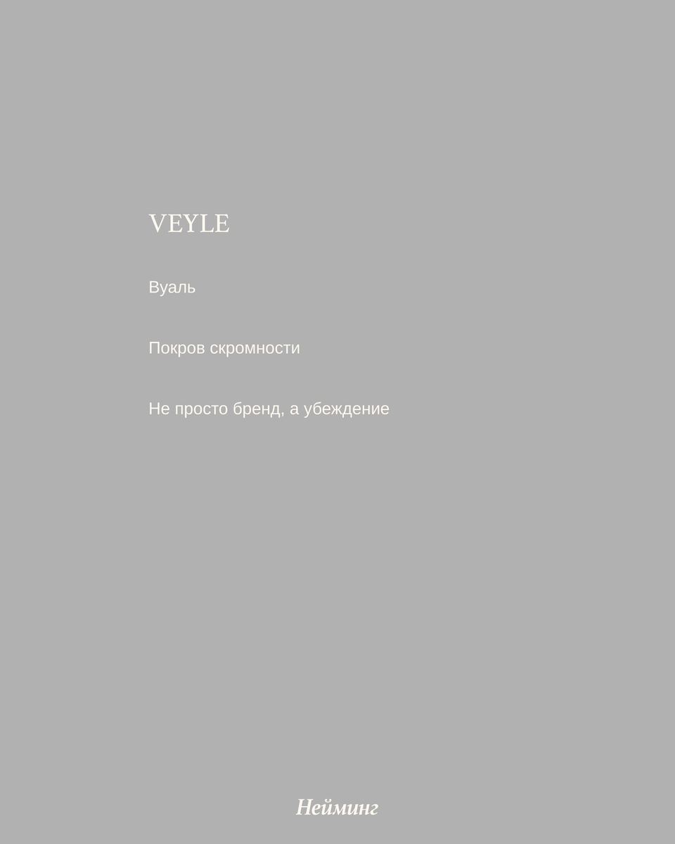
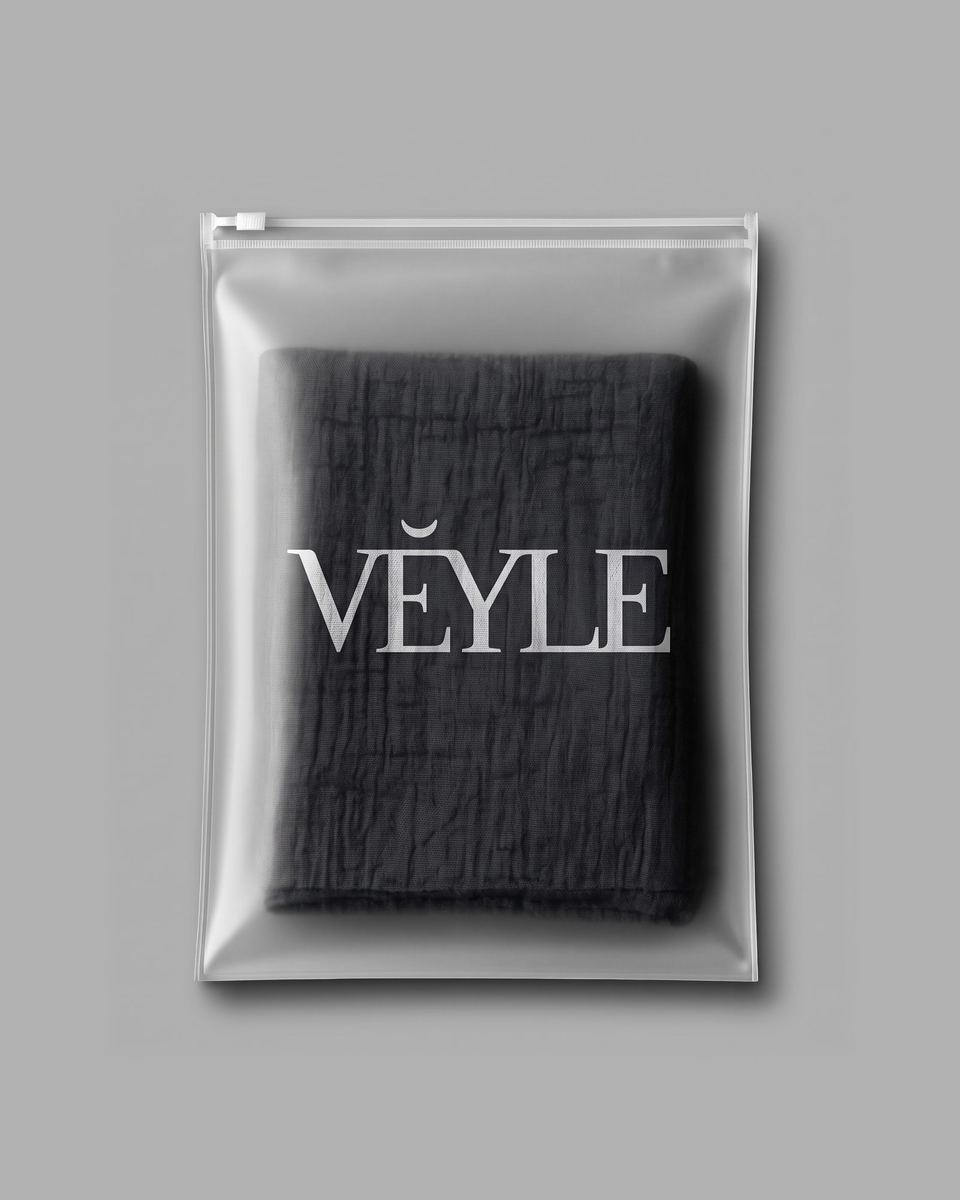
In this case, my goal was to show ease. In search of a light sound, through synonyms, I came across the word veil. I liked the way it sounded, but I didn’t like that in Cyrillic the shape of the letters in this word did not correspond to the sound. Therefore, I settled on the English “veil”, and to soften the pronunciation, I added an “E” at the end, so now it sounds like “veile”. The logo, associated with clothing, strongly suggested a font, and I did not contradict this inspiration. I just worked out the connections and added a graphic sign, which at the same time acts as an accent on the main syllable. The sign itself carries Islamic symbolism in the form of the moon and a smile, as the personification of the kindness inherent in a Muslim.
Nothing found.